Design System - Card Component Evolution
Moving from Bootstrap HTML templates to a modern, scalable component system that could handle complex financial data visualization
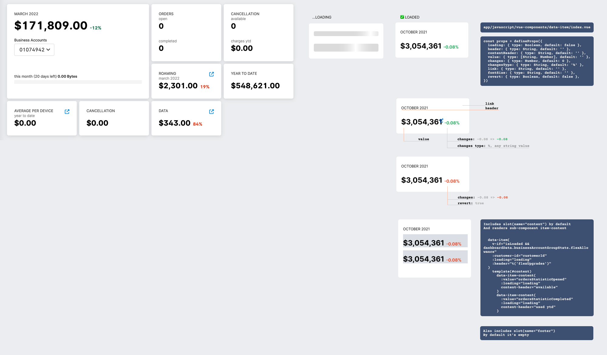
Before: Bootstrap Cards
Issues:
- Static HTML with inline styles
- No reusable components
- Inconsistent spacing and typography
- Limited interactivity
- No loading or error states
After: Vue.js Component System
Card Types Created:
1. Financial Metric Card
- Large primary value with currency formatting
- Trend indicators with color coding
- Period comparison data
- Progress bars for visual context
2. Status Card
- Clear status indicators
- Categorized sub-metrics
- Compact layout for dashboard grids
3. Data Visualization Card
- Integrated charts
- Time period selection
- Export functionality
- Responsive sizing
4. Interactive Detail Card
- Expandable sections
- Quick action menus
- Keyboard navigation support
- Touch-optimized targets
Component Architecture
// Reusable Card Component
<MetricCard
  :label="label"
  :value="value"
  :trend="trendData"
  :loading="isLoading"
  @action="handleAction"
/>
Design Tokens
// Spacing
$card-padding: 24px;
$card-gap: 16px;

// Typography
$value-size: 32px;
$label-size: 12px;

// Colors
$positive: #10B981;
$negative: #EF4444;
Impact
- Development speed: 40% faster with reusable components
- Consistency: 100% adherence to design system
- Maintenance: 60% reduction in CSS bugs
- Accessibility: WCAG 2.1 AA compliant