Generating Light and Dark Themes for an Archestra AI
You can't just invert the lightness — a deep dive into theme generation
While working on an open-source project, I tackled a theme generation task. The project had several themes: some supported both light and dark modes, others only one or the other. The goal was to produce both a light and a dark variant for every theme.
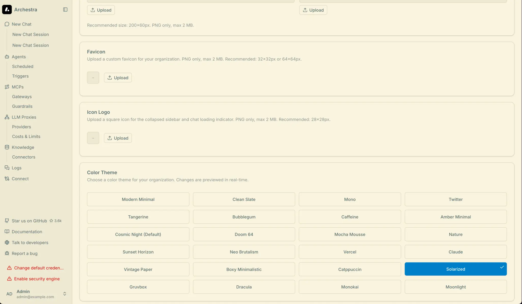
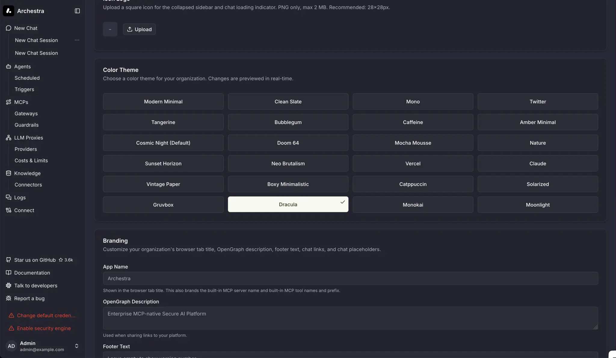
The screenshot above shows several dark themes: Dracula, Solarized, Gruvbox, Monokai, Moonlight. In theory you could just invert the lightness values and get a light theme. In theory, theory and practice are the same. In practice, they are very much not 😀. To explain why, it helps to first look at how color actually works.
A Bit of History: Solarized
In 2011, Ethan Schoonover published Solarized — a sixteen-color palette for terminals and editors. It became popular because the color design was built on a concrete methodology.
Schoonover designed the scheme with precise lightness ratios in CIELAB color space and a set of hues based on fixed relationships on the color wheel. The palette was tested on both calibrated and deliberately uncalibrated displays, under various lighting conditions.
The key property of Solarized is that its monotone colors have symmetric lightness differences in CIELAB, so switching between dark and light mode preserves the same perceived contrast between every value. This is achieved by precisely mirroring Lab coordinates: base03 and base3 are symmetric around the midpoint of the scale, as are all other pairs.
Solarized reduces brightness contrast, but — unlike many low-contrast schemes — retains contrasting hues for syntax highlighting readability. This matters because you need to reduce the "blinding" effect of white on black without losing element distinguishability.
That's why I consider Solarized an excellent example of a theme, even though I don't personally use it. The scheme embeds both a good idea and a good implementation: both modes (dark and light) should feel like parts of a single system.
Different Color Models
When we talk about color, we usually think in HEX or HSL. HEX is just RGB in a different notation, and while HSL is intuitive, it is mathematically dishonest. Two colors with the same L in HSL are perceived very differently by the eye. Green at hsl(120 100% 50%) is blindingly vivid; blue at hsl(240 100% 50%) is noticeably darker — even though they formally share the same "lightness."
Schoonover worked in CIELAB precisely because it is a perceptually uniform space: equal numerical distances between points correspond to equal perceived differences for the eye. This is what makes symmetry possible: if base03 has L=15 and base3 has L=97, their midpoint is L=56, and the entire palette is built as a mirror around that axis.
Modern design systems are moving to OKLCH — an improved version of the same principle. In OKLCH, L (lightness) means the same thing regardless of hue. Colors with L = 0.55 are perceived as equally bright. This allows palettes to be built more systematically rather than by eye.
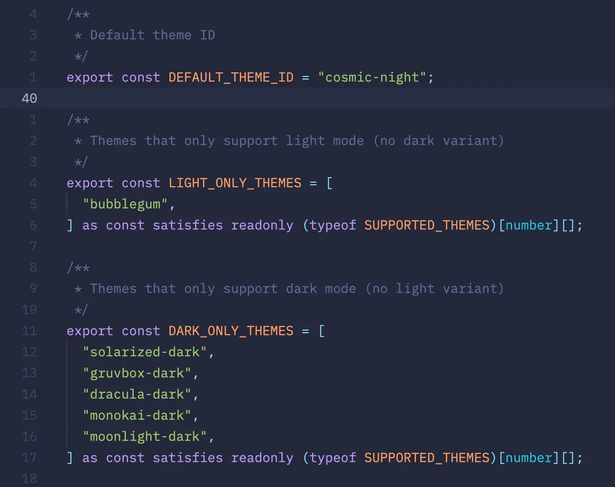
In our project, themes are stored in OKLCH and rendered in the browser as lab().
The Contrast Problem
Solarized solved contrast manually through Lab symmetry. In our case, we can't hand-tune everything. The current implementation relies on automatic generation with no built-in symmetry — we only have numbers to verify.
To check contrast, we can use relative luminance, as defined by WCAG. But luminance is relative, so we can't rely on it as a direct proxy for L in OKLCH.
Blue and violet colors at L ≈ 0.55 yield a relative luminance of about 0.22–0.25, giving a contrast ratio of ~5:1 against white text — sufficient for comfortable reading. But yellow and orange at the same OKLCH lightness have luminance values of 0.35–0.45, and the contrast with white drops to 2.5–3:1 — not enough for readability.
The first attempt at generating light themes for Gruvbox and Monokai produced a golden primary color with dark text on top of it. Visually, it looked bad. I don't have screenshots, but trust me — it was rough. So for subsequent generation I decided that warm chromatic primary-color values (yellow, orange, gold) need L lowered to 0.45–0.50 with white foreground-color. Cool colors (blue, violet) can stay at L ≈ 0.50–0.58. This can't be computed automatically without analyzing the specific color.
The Visual Identity Problem
Any theme generated as a companion to an existing one must satisfy at least two conditions:
- correct contrast
- recognizability
Solarized is an extreme case — its identity is documented in precise Lab values. But many themes lack that kind of documentation.
Dracula, for example, is recognizable by its purple-pink hue from #bd93f9. But that color is reproduced differently across editors. On top of that, many themes have multiple variations — not just one dark or one light variant, but whole sets.
The first auto-generated version of Dracula light used --primary: oklch(0.550 0.178 295°). The color was a bluish-violet, with acceptable contrast against white. Technically correct. But the resulting shade leaned more purple-pink — and at 295° the theme started to resemble Moonlight. A 10-degree hue shift was enough to destroy the identity.
The Inverted Accent Logic
The project uses shadcn components. One non-obvious shadcn convention is how accent works in light vs. dark themes.
In a dark theme, accent is a saturated color used to highlight active elements. In a light theme, accent is a very pale, near-white surface for hover states, and accent-foreground is dark text on top of it.
When generating automatically by copying dark accent values into light variants, you end up with elements that have a saturated background and light-colored text. The result can be described with an unflattering emoji, but I'll spare you 😁.
Conclusion
In the end, this turned out to be a genuinely interesting problem. You can't just copy-paste and call it done. Each theme requires understanding its identity, verifying contrast, handling the accent inversion, adjusting, and checking again.
The results are below, or you can open the pull request and explore the code. There's still room to refine things further. I didn't have a year like Schoonover did, but I think the result came out pretty solid.
Solarized Light
Solarized Dark
Dracula Light
Dracula Dark
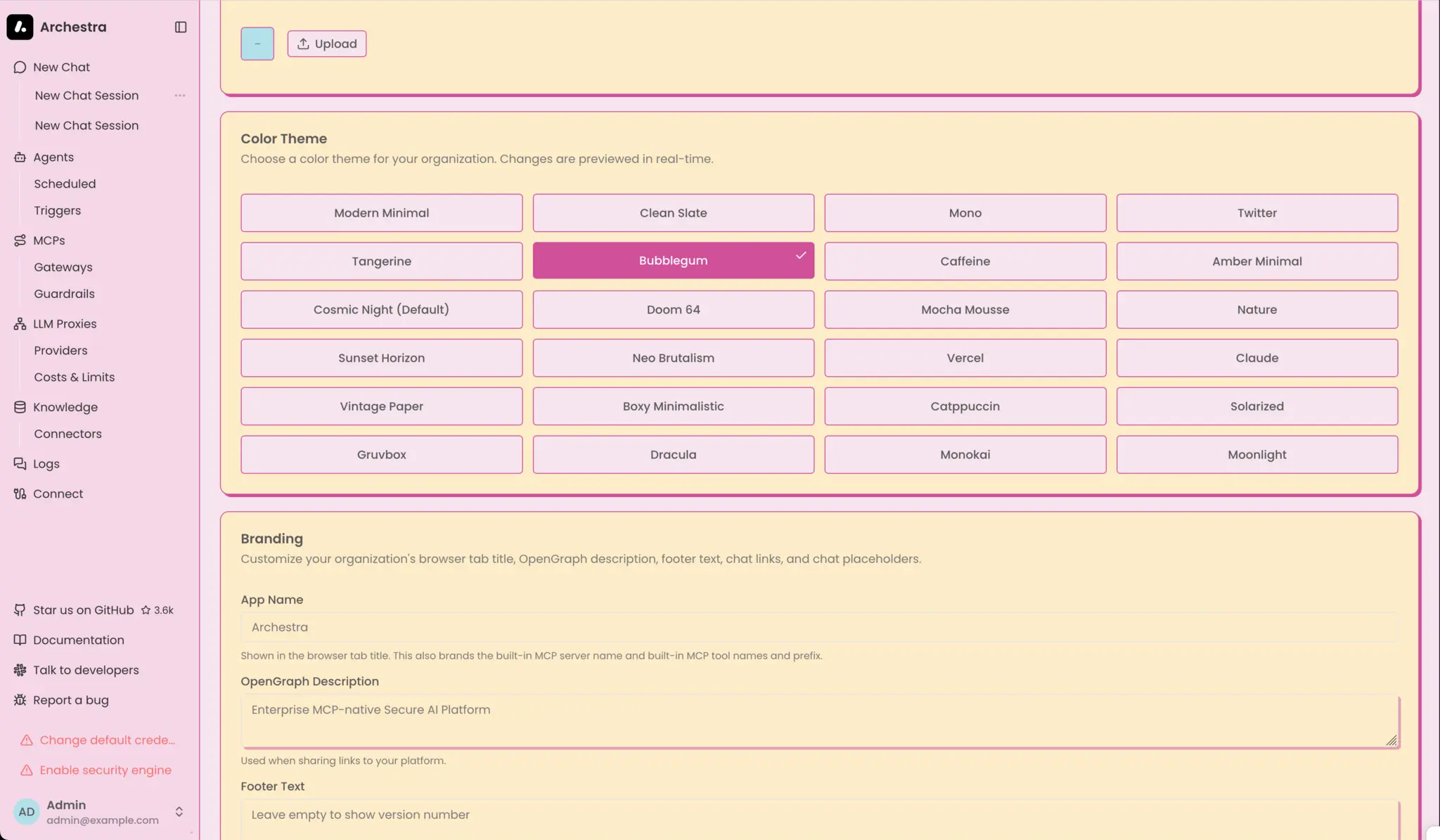
Bubblegum Light
Bubblegum Dark